Pontus Joneström
Project Manager / Game Designer
Hello there!I am Pontus, a Project Manager and Game Designer based in Stockholm, Sweden, with a passion for creating engaging and memorable experiences.
Games
Work
About me
I am a Project Manager and Game Designer based in Stockholm.Previously I have worked many years at Gröna Lund, the amusement park in Stockholm, as Operations Manager for the rides, Haunted House Production Manager and Content Creator. Transitioning from the theme park industry to the games industry turned out to be more natural than expected. Both industries are fast-paced and iterative, the theme park industry thanks to its seasonal character. Designing haunted houses is also quite similar to designing levels. Both require us to create engaging experiences, while retaining a sense of agency.Creativity and organization are probably the words that best describe me and the way I work. I believe creativity is important not only for creating games or movies, but for all processes. This view has helped me propel projects forward in my professional career. But every project needs organization and good planning, to make sure it can finish on time and deliver what was promised.My leadership philosophy is all about trust. As a leader, my job is to provide the best tools and instructions, not the solution. If you trust the people to find the solution, they will. I am also a firm believer in giving an abundance of positive feedback. People who feel good about their work will do great work.I love games and adventure. When I am not playing a new exciting narrative driven game, RPG or hyped indie, I also enjoy going out on my humble little sailboat.
Super Accurate Washing Simulator
Product Owner / Gameplay Designer
This game was made as a game project during the first year of studies at Futuregames. It was made by a team consisting of designers, programmers, artists, project managers and QA at the school. My main role was Product Owner, but I also worked as a Gameplay Designer.
| Project length | 4 weeks |
| Year | 2022 |
| Team size | 12 |
| Engine | Unity |
| My roles | Product Owner, Gameplay Designer |
Description
Super Accurate Washing Simulator is a goofy, unpredictable, physics based game where you play as a shaky washing machine. Stumble into furniture and break doors on your way to find all the dirty laundry in the apartment.
Brief
The theme for the project was Chores and the sub category for my group was Laundry Cycle. Other requirements were that it should be a single player game made with Unity that could be played in less than 20 minutes.
My work as Product Owner
Tools and how I used them
Miro was used for ideation and early planning. As soon as an idea was settled upon, we switched it for other tools.
Jira was used for task management. We used tasks instead of user stories because it quickly turned out to better suit the team. Different team members wanted different amount of granularity in the task so I adapted to each team member when filling out the backlog. I also created a custom issue layout for bug reporting.
Notion was used for my personal documentation and reflections. It was also a tool to keep track of all project management tasks to make sure I could help the team in the best possible way. Lastly It was also used for the Game Design Document.
Perforce was used for version control. To make sure the team could easily collaborate, I created prefabs for different parts of the level and all interactable items.
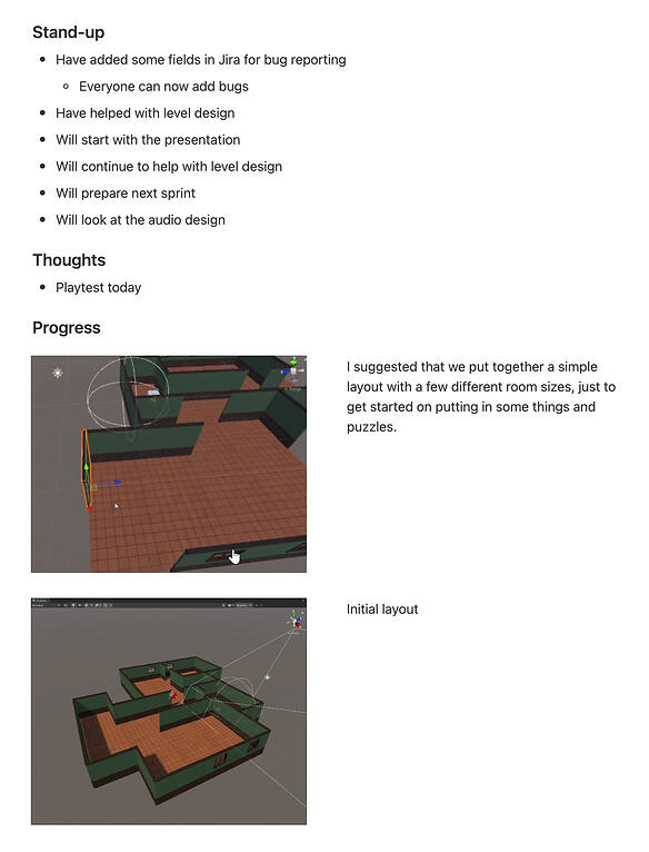
↑ Example from my daily documentation
Organized the team
The team worked remotely and most of the team members had never met before. Because of this it was important to foster a team spirit and active collaboration.
I encouraged being online during work hours by always being active myself and making sure to talk to everybody daily and help out where I could.
The team also had project managers, so in the beginning I had a meeting with them to figure out responsibilities. We decided that I would focus on updating the backlog and design documents, and they would facilitate the SCRUM meetings.
Whenever someone was ill or missing, I kept in contact with them to make sure they were okay and also brought them up to speed when they were back.
Game Design Document
I set up a Game Design Document using Notion to make it easily accessible to all team members.
The document included the pillars, three C’s, level design, gameplay, art style and more.
I encouraged everybody to look through it to make sure we had a unified vision.
I also asked the other designers to fill in the document in regards to their fields, such as UX Design.
I updated the document after every new decision during the project.
↑ Excerpt from the Game Design Document
Backlog refinement
Although the Design Document was helpful for the designers, it was more important for the rest of the team that the backlog was clearly structured and with the relevant information for each task.
At the end of every week we had a playtest where we got feedback on the current state of the game.
We had meetings after the playtests to discuss the feedback and decide what to focus on for the next sprint.
I updated the backlog accordingly and prioritized the tasks.
When necessary I added details to specific tasks.
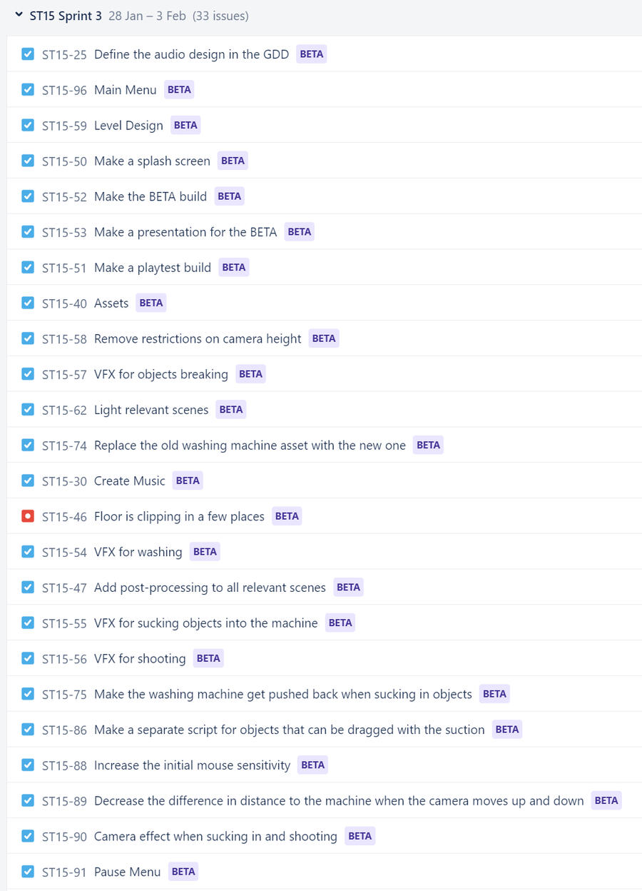
↑ The backlog during the Beta Sprint
Scope and cutting features
Because of the short timeframe for the project it was important to scope it properly. Many ideas came up during the first week. Some features, such as a first person view, was also implemented in early prototypes. After the alpha playtest, the designers wanted to cut the feature but others, such as the programmer who coded the feature, wanted to keep it. As this was a school project, it was important that everybody had equal say. For that reason we had a thorough discussion and eventually the others on the team understood why the designers wanted to cut the feature and agreed. The reason was that it removed the player’s connection to the character and the visual indication of making a mess in the apartment that the third person camera provided.
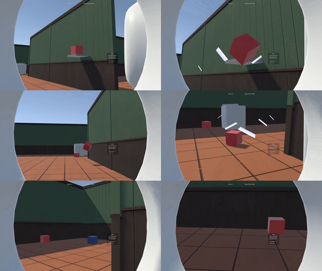
↑ First Person View that was eventually cut
My work as Gameplay Designer
Design Pillars

Playful
A playful vibe should be embraced in all aspects of the game. Everything from character, animations, gameplay, music, sounds and art.

Chaotic
Gameplay should feel a bit chaotic. Movement is clumsy but not without control. While reaching the goal, chaos should arise.

Repetition
The core loop is is a repetition of finding all the clothes, but the placement of the clothes should feel quirky and fun to make it interesting. A timer and a messiness counter invites the player to repeat the game.
Core Loop
The goal is to find all the dirty laundry in the apartment while wreaking havoc in the process.
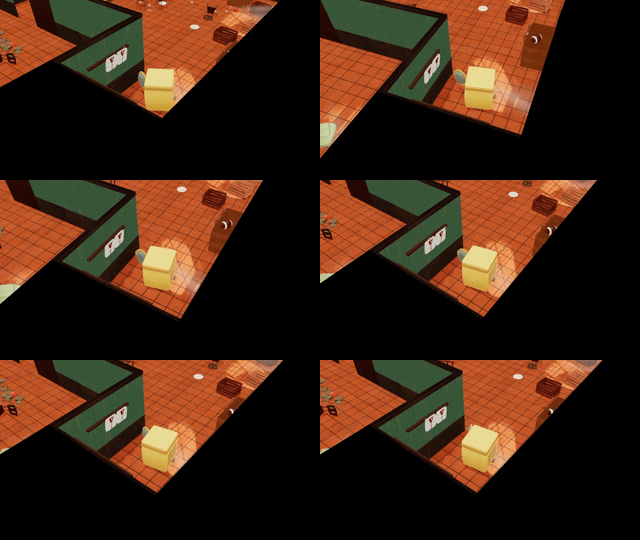
Look for dirty laundry
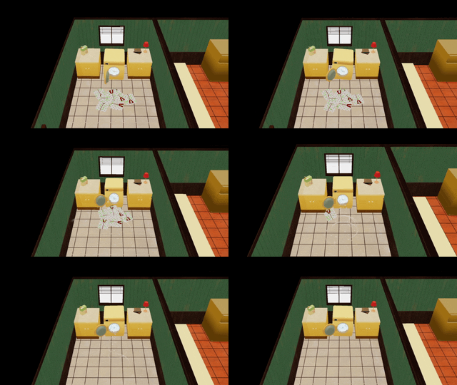
Suck up dirty laundry
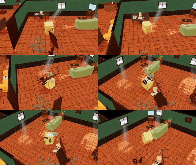
Wreak havoc
Character
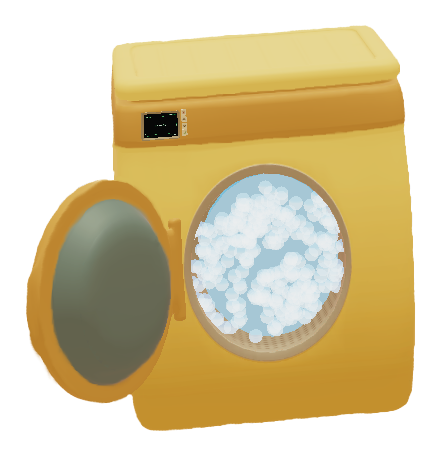
The character is an artificially intelligent washing machine which only goal is to find all dirty laundry. To add to the playfulness it was important to give it character. The controls and the mechanics play their part. We also gave it a happy yellow color and used some stretch and squeeze animations and bubbly VFX to give it more personality.
Controls
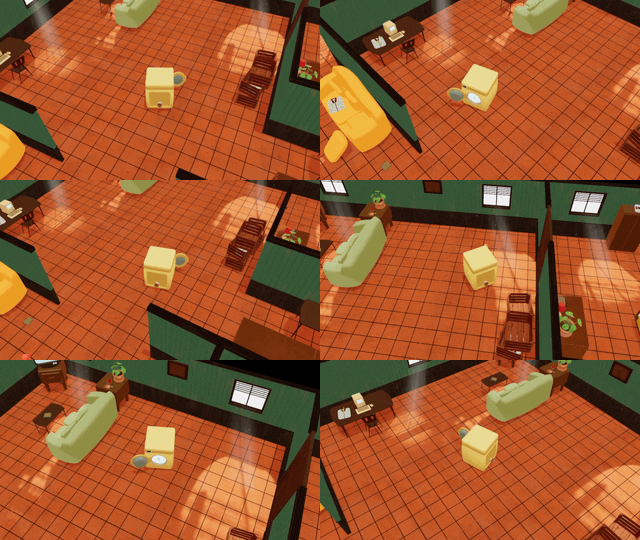
To make it feel playful, I wanted the washing machine to be shaky, clumsy and random, but still controllable. This was achieved by the programmers by adding random forces to the washing machine. In the first playable, it was very hard to control so the forces was reduced to improve mobility, but still enough to stand out visually.
Camera
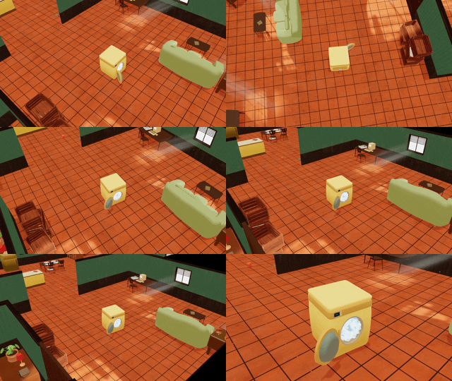
We decided to go with a third person camera to allow for the player to really see all the mess they make accidentally as they move around trying to find clothes in the apartment. We also gave the player control to zoom in and out.
Suction Mechanic
As the movement was made more controllable, we wanted something else that could cause more chaos in the game according to the pillars. We also needed a way to pick up clothes. We combined these requirements with the suction mechanic. The player need to use this ability to get the dirty laundry and while using it, they will also move around other items in the vicinity.
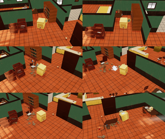
Shooting Mechanic
When the player uses the suction mechanic, they will also get smaller items. After a few items, they start to move slower. To get rid of the items they have to shoot them out, causing more chaos in the process. To teach this mechanic we made doors in the apartment that are only destroyed by shooting items at them. The room where the player starts acts as tutorial where they have to shoot the door to continue. To add to the playfulness, the player also gets pushed back when shooting.
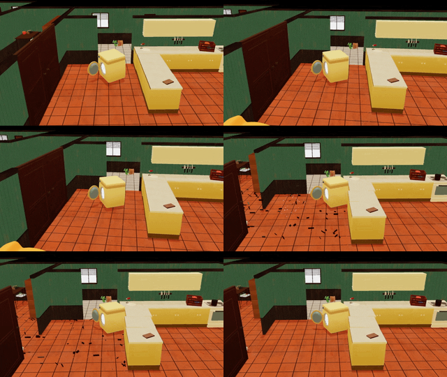
Process
Schedule
| Date | Milestone |
|---|---|
| Jan 20 | First Playable |
| Jan 27 | Alpha |
| Feb 3 | Beta |
| Feb 10 | Gold Master |
Pre-production
We started out by brainstorming ideas. The first step was to let everybody in the team come up with as many ideas as they could. After that we talked about them and explored them.
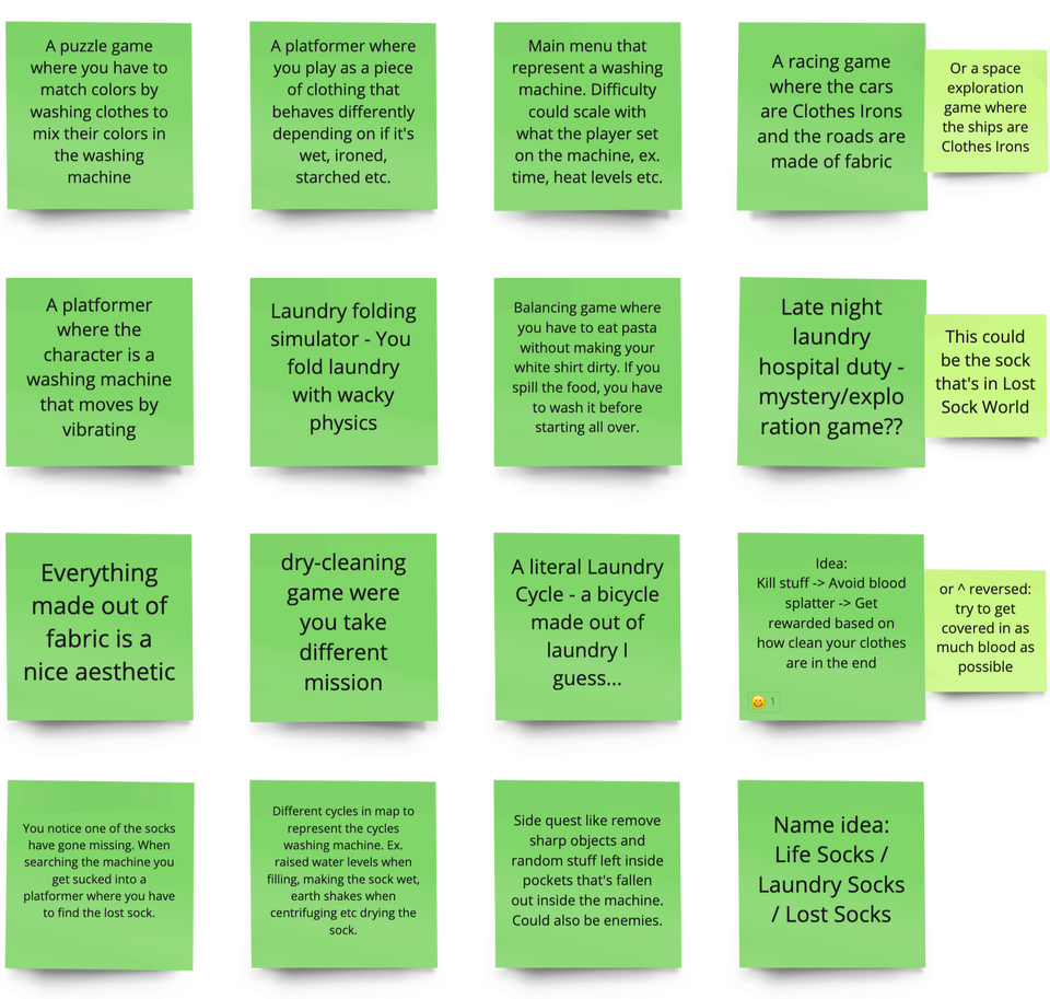
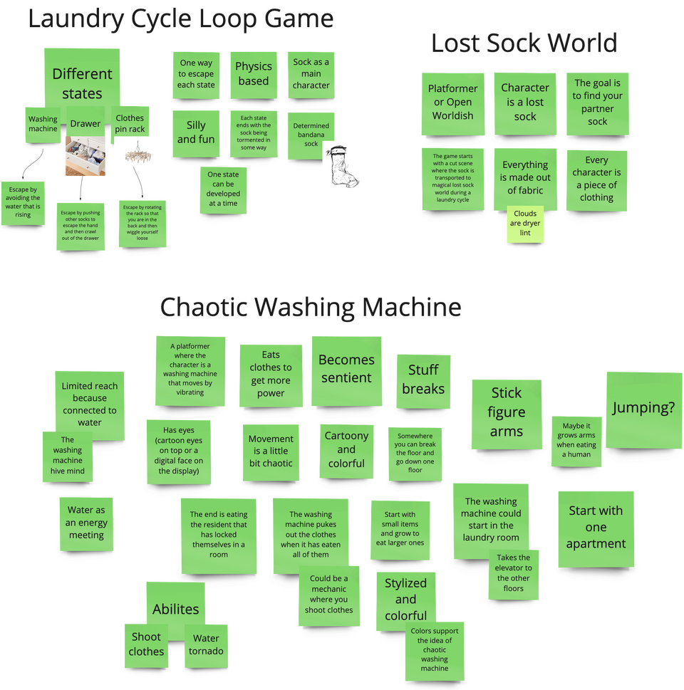
Eventually we settled on three ideas that we explored even further and tried to figure out how they would work in practice. It was pretty clear after this that everybody liked the Washing Machine idea, so we went with that.
First Playable
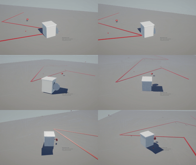
The first prototype showed promise and early playtesters enjoyed the concept. They felt however, that the movement was rough.
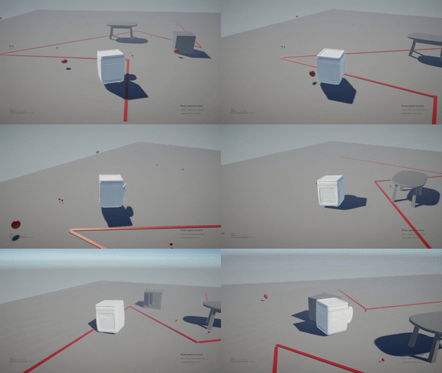
Pretty soon after the first playtest, we reduced the random forces added to the machine to make it more controllable.
Alpha
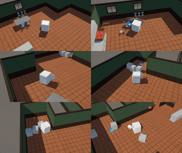
By the time of Alpha we had implemented the suction mechanic and ability to pick up clothes.

The level design blockout for the alpha build.
Beta
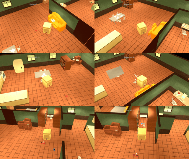
For the Beta we now had most of the physics interactions implemented. The UI was partly implemented but we were still working on getting the HUD right. Some lighting had been put in.

Laundry under the couch pillow. At this point we tried to find as many fun locations for the clothes as possible. We wanted locations that would both provide a challenge in finding, but also cause a lot of chaos when picked up.
Gold Master
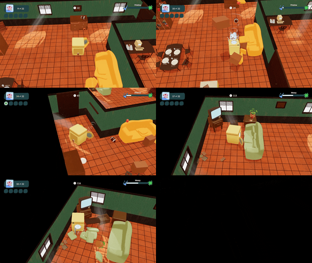
For the final game we added polish in the form of lighting, VFX, animations, SFX and some shader work to tie it together.
Carnage at Castle Moon
Product Owner / Gameplay Designer
This game was made as a game project during the first year of studies at Futuregames. It was made by a team consisting of designers, programmers, artists and QA at the school. My main role was Product Owner, but I also worked as a Gameplay Designer.
| Project length | 7 weeks |
| Year | 2022 |
| Team size | 14 |
| Engine | Unreal Engine 4 |
| My roles | Product Owner, Gameplay Designer |
Description
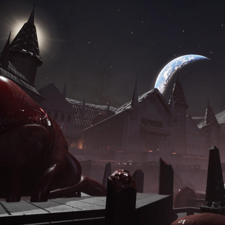
Carnage at Castle Moon is a single player FPS. You play as a monstrous knight that is part of a living castle on the the moon.You will be challenged with waves of astronauts who try to destroy the hearts of the castle. Your goal is to survive as long as possible and get a high score.
My work as Product Owner
Organized the team
The team worked remotely and most of the team members had never met before. Because of this it was important to foster a team spirit and active collaboration.
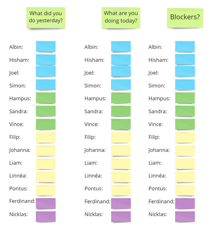
I encouraged being online during work hours by always being active myself and making sure to talk to everybody daily and help out where I could.
During the daily stand-ups, if anyone was blocked or didn't know what to do, I always addressed that after the meeting.
Whenever someone was ill or missing, I kept in contact with them to make sure they were okay and also brought them up to speed when they were back.
Ideation
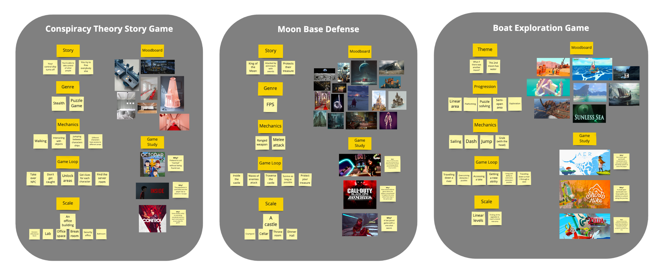
After brainstorming lots of different ideas, we settled for these three that we explored even further.
Everybody split up in teams to develop the ideas further.
To give us a better understanding of scope, I encouraged thinking of the idea using the following properties: Story, Genre, Mechanics, Game Loop, Scale
With those things figured out we had a good understanding of each idea. The game we then ended up working on was decided by vote.
Moodboard & Styleguide
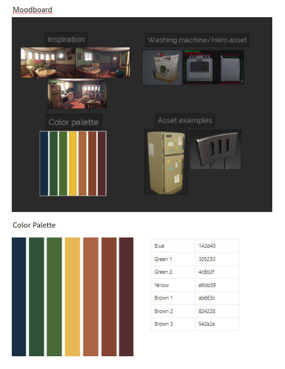
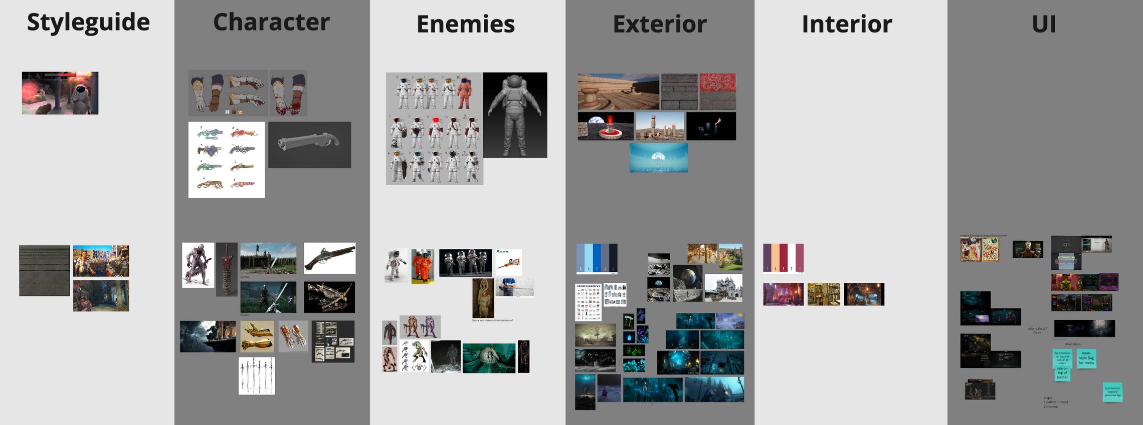
For the moodboard and styleguide, I created this structure where everybody could add and change details during the project.
The top row has concept art and the bottom row has a moodboard.
Backlog Construction
When the idea and moodboard was done, the team was ready to start working, but we still needed a backlog.
As this was a school project and we were using the SCRUM methodology, it was important to invite all team members to plan out the backlog.
I created this structure and gave everybody some time to fill out user stories in each category.
After that we had a discussion about the notes to make sure nothing was contradicting something else and that we could all agree on the vision.
From this result, we wrote tasks in the backlog.
Game Design Document
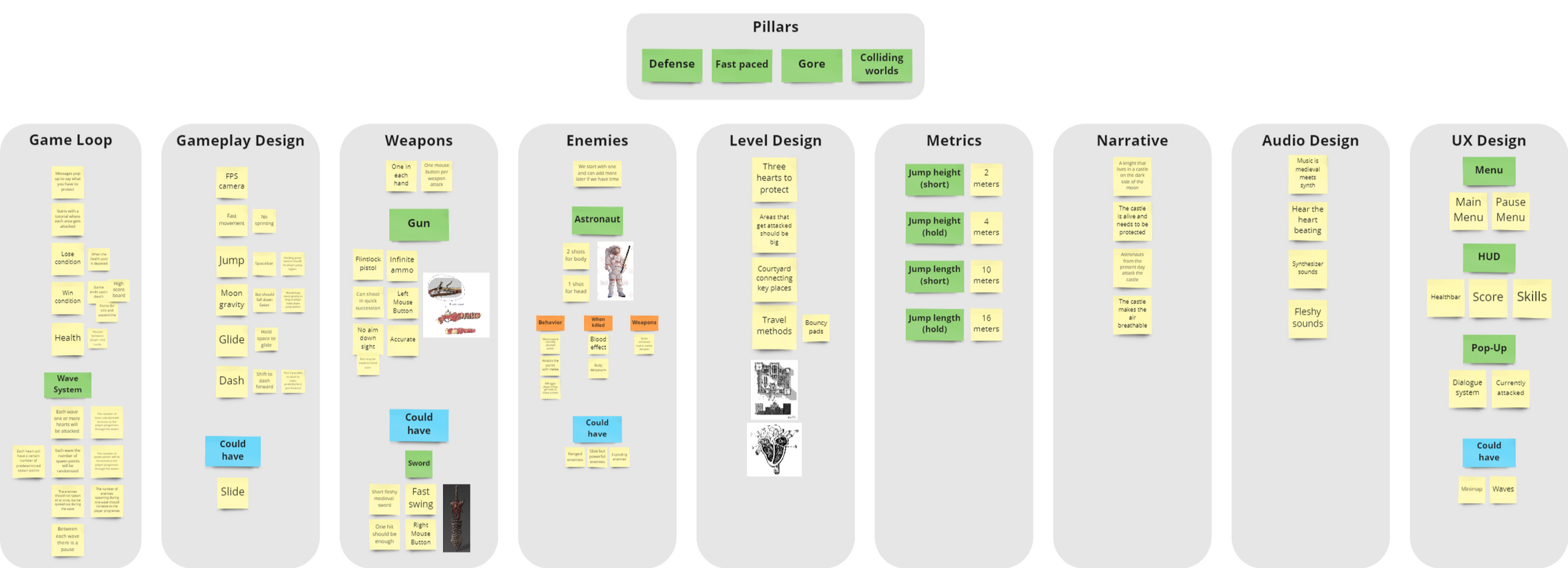
For this project I chose to use Miro for the Game Design Document.
This tool was already used for ideation and was provided by the school.
This made sure it was easily accessible by everybody on the team.
I created a very simple layout and kept information brief. The goal was to make it easy to digest to encourage the team to use it.
This structure also made it easy to update after new decisions was made.
I regularly asked the team for feedback to make sure the GDD was according to plan.
Scope
The semi-realistic art style chosen for the game made it important to scope the game right so it could be finished on time.
This was done in the initial planning, but when the most important gameplay elements were in place I also called a meeting to decide what features to include. I listed all features that had been discussed and asked the team to discuss what to keep.
This helped us focus on the features that would add the most to the game.
Set deadlines
At the start of the project we would use agile methodology to create and divide tasks.
After a couple of weeks it became clear that this was not enough to finish on time.
I started having meetings where we set deadlines for important tasks.
This helped us finish the game on time.

My work as Gameplay Designer
Design Pillars

Defense
The player steps into the shoes as the villain and has to defend three weak points in their living castle. These points share one single health pool with the player and increasingly difficult waves of enemies must be stopped.

Fast-paced
To allow for fast-paced gameplay and movement the level should be small and open with contrasting colors for important objects and enemies. The player should have high mobility and enemies should be killed with one shot.

Gore
The player is a monstrous knight in an organic, living castle. Visual effects and environmental details should be filled with blood and organic material.

Colliding worlds
A unique setting where medieval fantasy meets future astronauts in a war that has raged on for a long time.
Core Loop
The goal is to defend three points on the map from waves of enemies, with the difficulty increasing each wave.
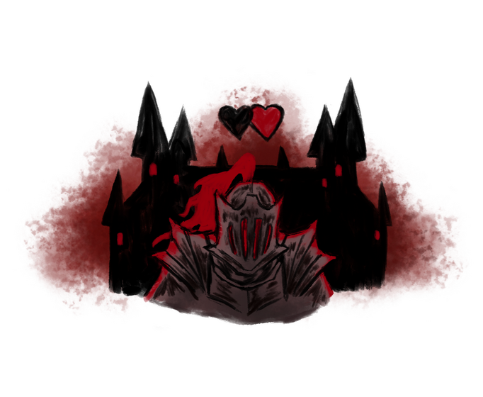
Protect the castle
The castle has three hearts across the level that must be protected. Every wave a certain number of these hearts is under attack.
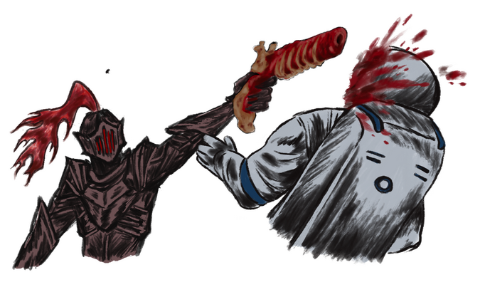
Kill astronauts
Run between the attacked points and kill all astronauts that spawn before they reach the hearts.

Get high score
Each astronaut killed adds to the score. The player gets their score when they eventually is defeated and if it’s high enough, it gets added to the high score list.
Work Method
I did the Gameplay Design in collaboration with one of the programmers. The goal was to give the player high mobility to be able to quickly move between the hearts when several of them are attacked at the same time. To get a feel for the movement for the game, I started out by doing a prototype with the Unreal first person template and making adjustments with Visual Scripting.After that I had a discussion with the programmer who then started working on the movement system in C++. During the rest of the project we would have meetings regularly where we discussed improvement and details. We figured out the appropriate values that could be exposed so that I could tweak the character movement to the player’s liking. I played the game daily and also did playtests with external players to get feedback on the gameplay.

Movement
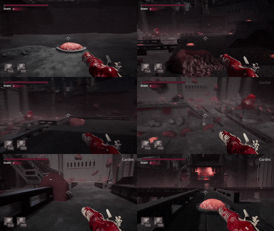
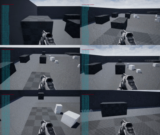
The movement speed is fast and the player has a high level of control. To achieve this, we made the player fall down faster than they jump up. We also gave the player high level of air-control and the ability to jump higher by holding down the jump button.
Dash
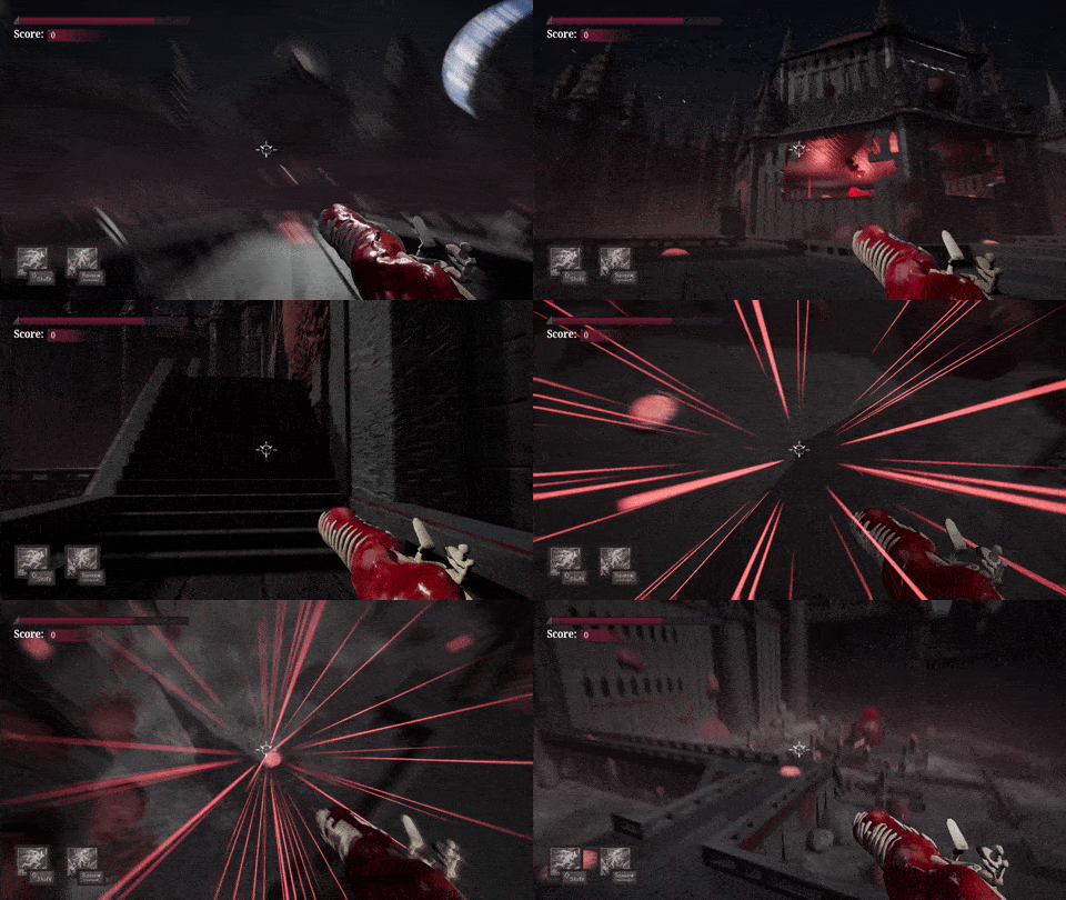
The player has a dash ability that allows them to dash in the direction they are looking. The cooldown for this is very fast, so it feels practically unlimited. This was important to let the player move quickly between attacked hearts. To add to the game feel and clarity, I made an effect for the dash that changed the FOV of the camera and spawned speed lines during the dash.
Glide
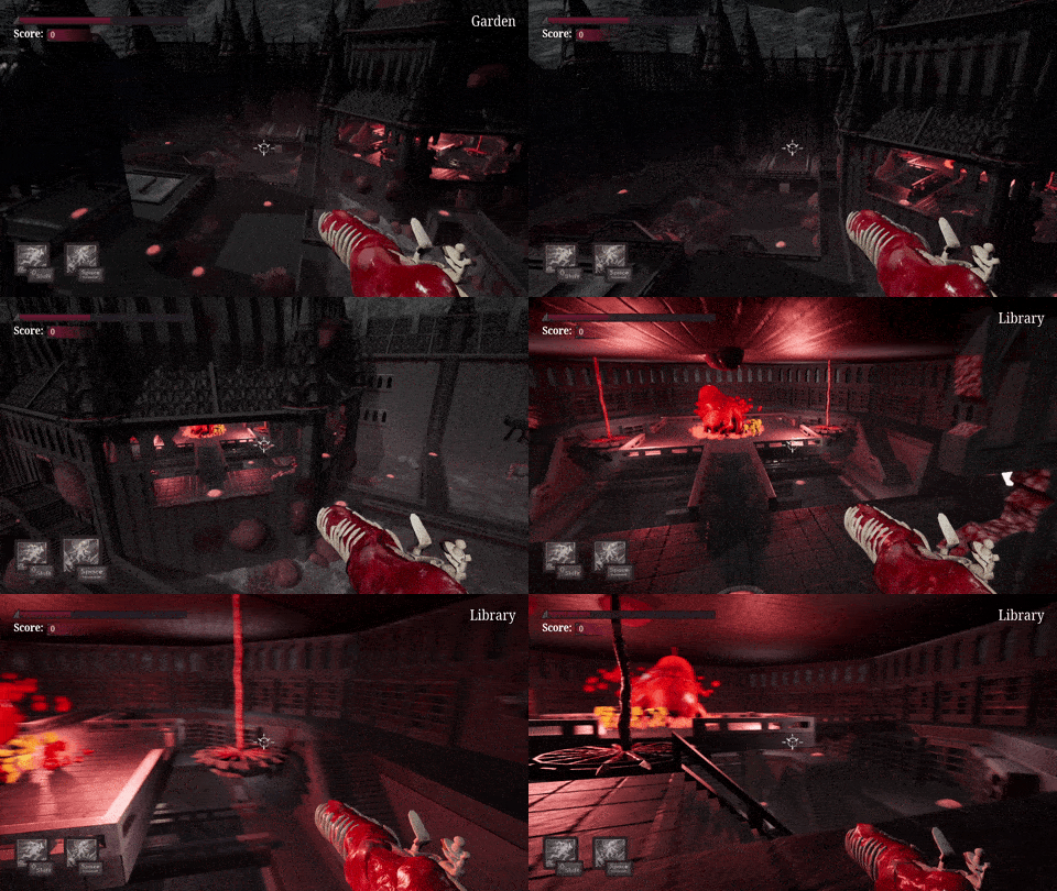
The player can also glide by holding down the jump button. If the player is falling, they will slow down and start gliding. There is no limit on how long the player can glide, which also serves the purpose of giving the player high mobility when multiple hearts are attacked.
Wave System
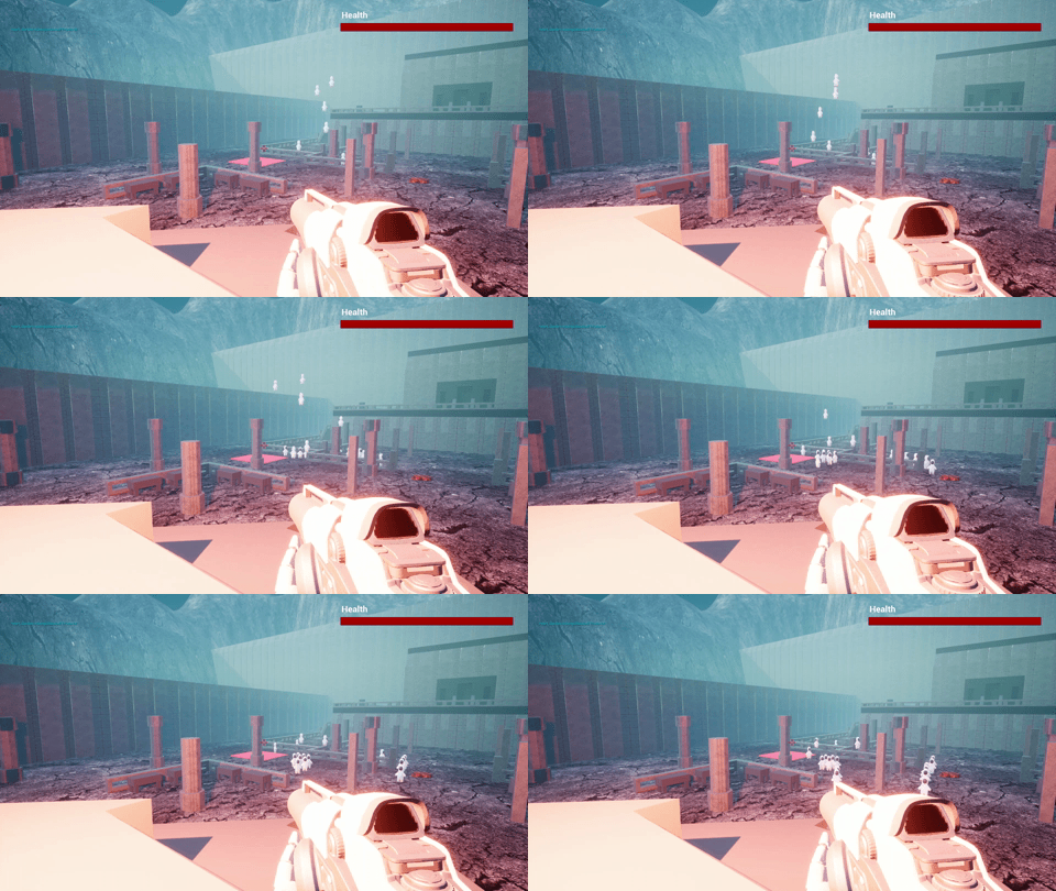
For the initial playtesting I prototyped a simple Wave System with Visual Scripting. This version had only spawning enemies, but no progression and very simple elements of randomness. The actual Wave System was done in C++ and was much more complicated, so we needed something quick to be able to playtest the game properly.
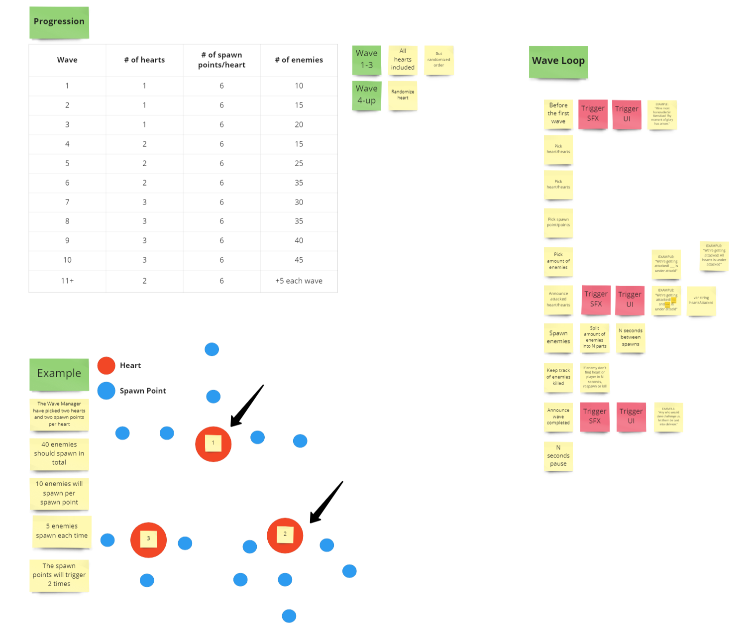
For the real Wave System, one of the programmers was assigned to develop it. To get started we had a meeting where we wrote down every step of a wave. This could then be used by all team members when implementing some part of the system, like dialogue triggers for example. The system was then continuously playtested and adjusted during the rest of the project.
Readability
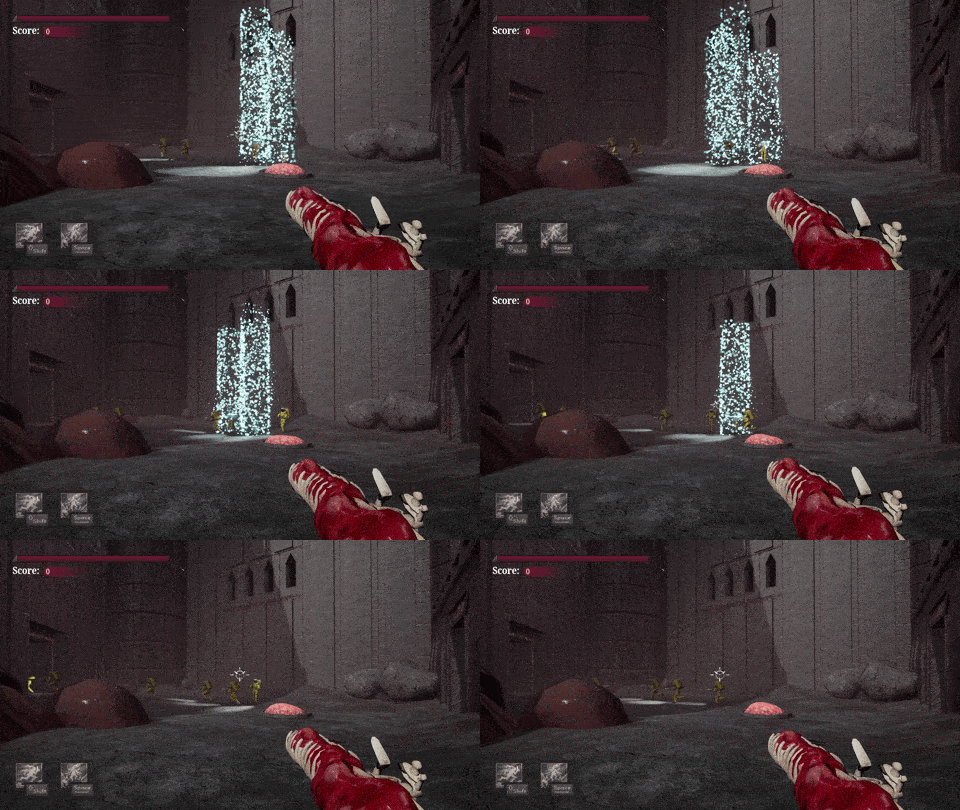
For the real Wave System, one of the programmers was assigned to develop it. To get started we had a meeting where we wrote down every step of a wave. This could then be used by all team members when implementing some part of the system, like dialogue triggers for example. The system was then continuously playtested and adjusted during the rest of the project.
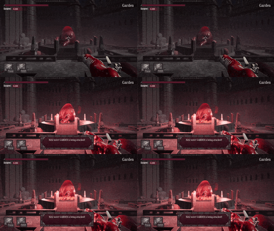
For the hearts we split it up into two stages of danger. The first being when a heart is included in a wave. A sound is played and a dialogue pop-up appears telling the player what hearts are under attack. The hearts also light up and a smoke effect is played at their base.
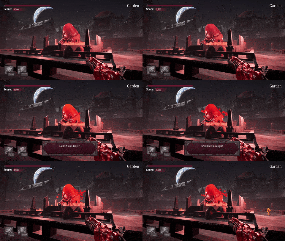
The second stage is when a heart is in immediate danger, which means enemies are close to it. A dialogue pop-up appears, a sound is played and the hearts starts to bleed and turn to a deeper red.
Process
| Date | Milestone |
|---|---|
| May13 | Pre-production |
| May 19 | First playable |
| May 25 | Pre Alpha |
| June 2 | Alpha |
| June 9 | Pre Beta |
| June 16 | Beta |
| June 21 | Gold Master |
First playable
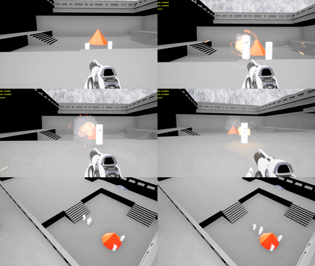
First playable showing simple AI and shooting.
Pre Alpha
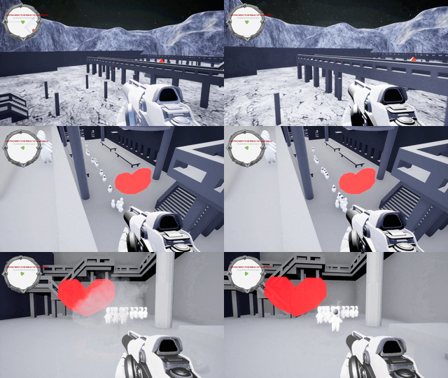
Pre Alpha build where AI now targets the player when player shoots at them. Gliding and moon gravity jumping was also implemented.
Alpha
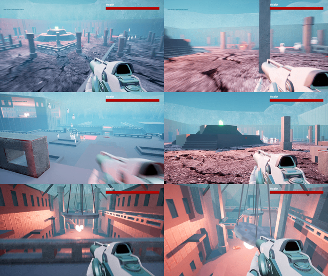
By the Alpha build, we had implemented a Blueprint version of the coming spawning system, which proved difficult to code. A health system was in place. Movement was also tweaked further and a dash was implemented.
Pre Beta
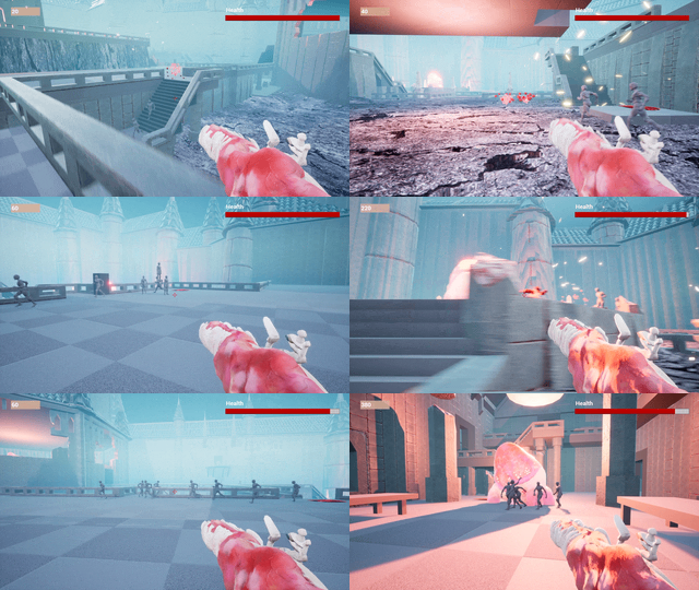
For the Pre Beta an animation system was added to the enemies. The AI pathfinding was also improved and some VFX was implemented. A score system was also in place.
Beta
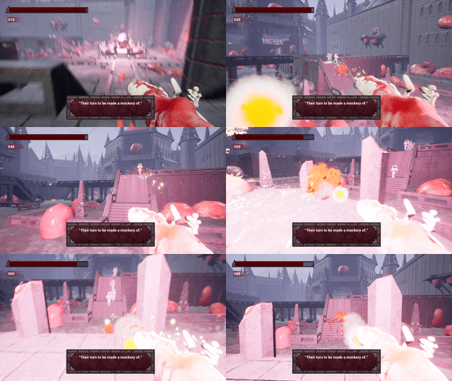
For the Beta, all features was now in place. Dialogue boxes with important information was now implemented. Still, players found it difficult to know where to go and which hearts where in danger. They also found the astronauts hard to see.
Gold Master
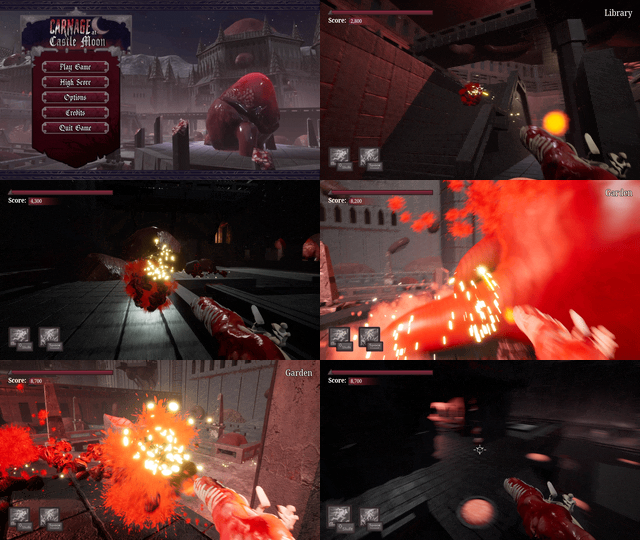
Beyond polishing the game with VFX, lighting, post-processing and audio, we also made some adjustments. The astronaut color was changed to yellow and a location prompt was added to tell the player what heart they where close to at the moment.
Gröna Lund
Production Manager Haunted Houses
As a Production Manager for the Haunted Houses at the amusement park Gröna Lund’s Halloween Season 2021, I was responsible for planning, efficiency and experience of the park's five temporary haunted houses. The work was mainly focused on preparation and developing new strategies for shortening wait times for the visitors while maintaining high quality and experience.
| Project length | 12 months |
| Year | 2021 |
| Company | Gröna Lund |
| My roles | Production Manager Haunted Houses |
What I did
Planning the Haunted Houses
The main focus was to increase efficiency by making sure visitors would easily find the way through the houses. This was done by changing the layouts in some crucial places where we had noticed previous years that visitors would often get confused or slow down. I also removed blockers like doors and drapes. In some places light was also used to guide visitors in the right direction. For quality, one of the haunted houses was also redesigned from the ground up with new rooms and scares.

Haunted House Design Documents
For each of the haunted houses I created a separate Design Document. The idea was that everybody from construction workers to management could have access to these so that everybody was on the same page and preparations could be done efficiently while maintaining quality. I chose Notion for these documents so they could be easily shared with relevant partners, updated in real time and being able to set and remove permissions as needed. Some examples of what was included:
Blueprints with fire safety, actor placement, working environment factors, effects and more.
Scene descriptions with actor instructions, safety procedures, and photos.
General information such as opening hours, age recommendations and narrative.
Queue logistics with blueprints for building the queue lines and signs.
Character info with instructions and images for make-up and costume.
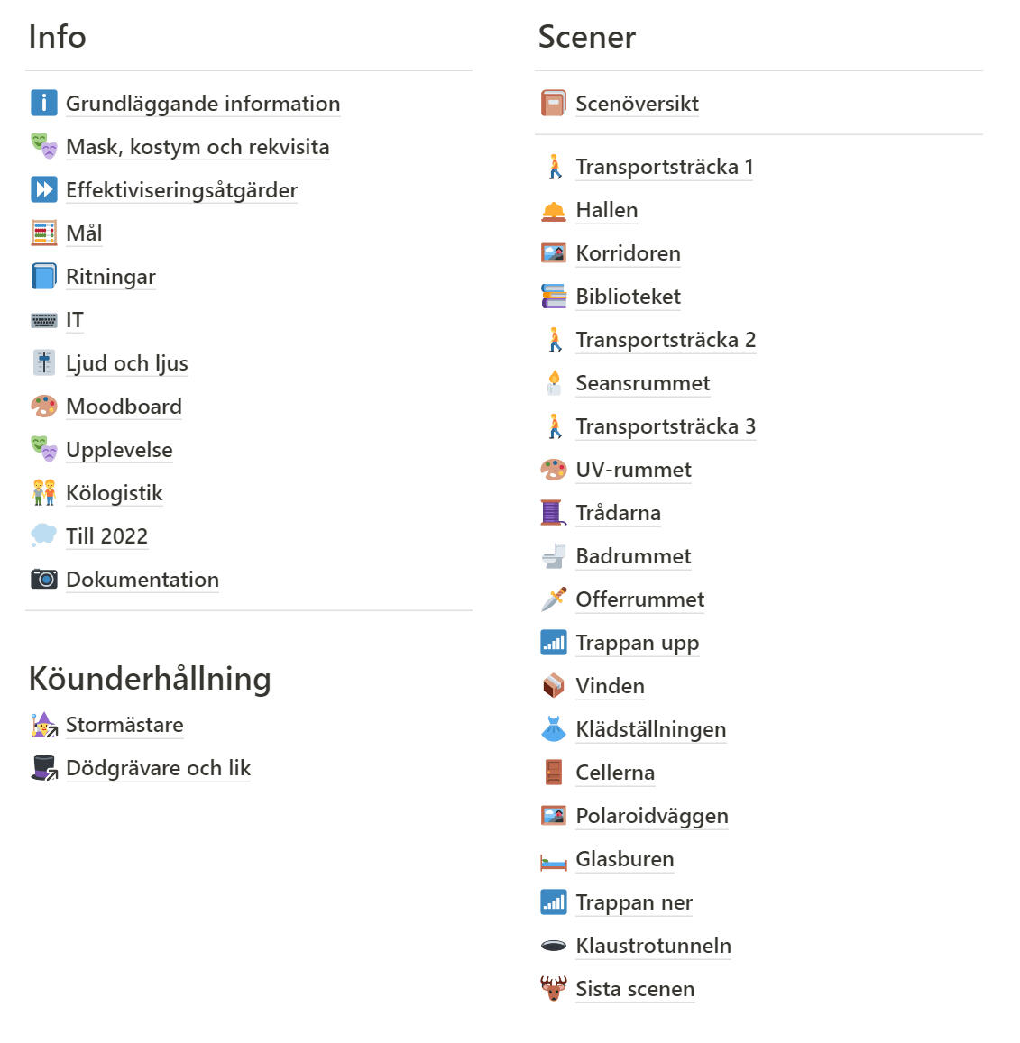
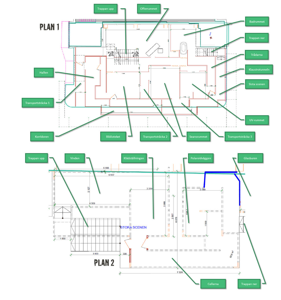
Clearly defined goals
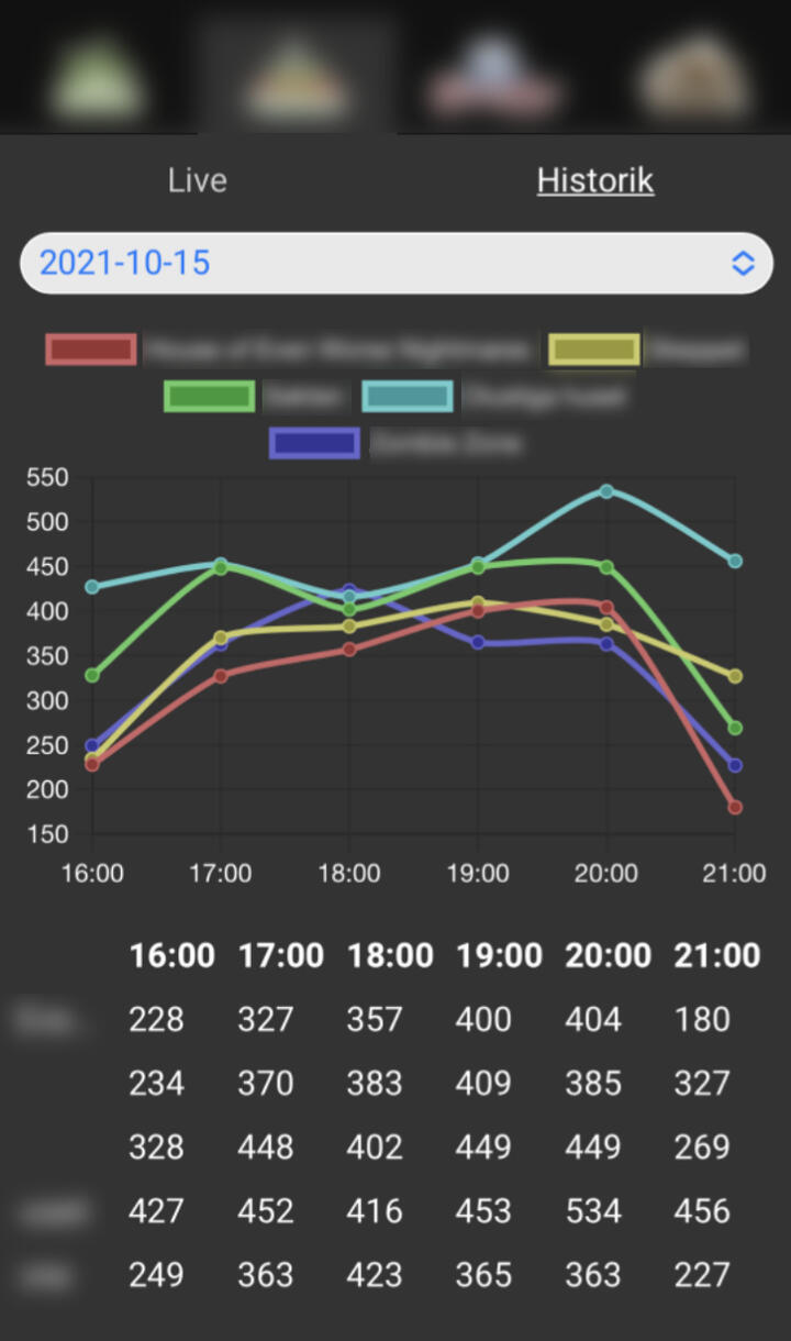
New goals for visitors per hour was set for each haunted house. These were calculated using earlier years’ data by investigating which of the haunted houses had high efficiency and identifying the reasons for this. The goals were then communicated to everybody working on the haunted houses, from management to actors.

App for real time statistics
To make sure efficiency could be measured easily in real time, I commissioned an app that was created by the IT department. The app was designed to be easy to use for staff members and management. It was also designed to remind the staff of the short term goals continuously.
Other details
Prepared information and documentation about more than 30 different roles and 300 actors.
Helped plan the recruitment process by preparing strategies for the auditions and how to reach as many potential actors as possible.
Continuous discussions with the external partners that would deliver costume and make-up.
Budget responsibilities.
Results
More than doubled the amount of visitors going through the haunted houses compared to previous years.
Significantly shorter wait times. Average wait time was reduced from 42 minutes down to 15 minutes.
Endorsements
"It was a pleasure working with Pontus! He is a creative and structured production manager. He always met the deadlines provided. During the project he was able to lead the work in doubling the capacity of our haunted houses by thinking in new ways and making sure all departments worked towards the same goal."
- Johan Lotsander, Business Area Manager at Gröna Lund
Hi-Bit Studios
Level Designer / Project Manager
| Period | March 2022 - August 2023 |
| Company | Hi-Bit Studios |
| My roles | Project Manager, Level Designer |
What I did
Designed and prototyped gameplay mechanics through paper prototyping
Implemented level designs, collaborating with the team to enhance gameplay
Managed project tasks, overseeing QA tickets in collaboration with the producer
Endorsements
"Pontus is a highly talented level designer, with excellent practical skills and a creative mind. He is actively participating in discussions and is easy to collaborate with, both when the designs are his own and when working on other designers creations. He is also good at meeting deadlines and following the structure and milestone plan of the project."
- Tobias Bjarneby, Producer at Hi-Bit Studios

